Life's a garden. Dig it.
Challenge
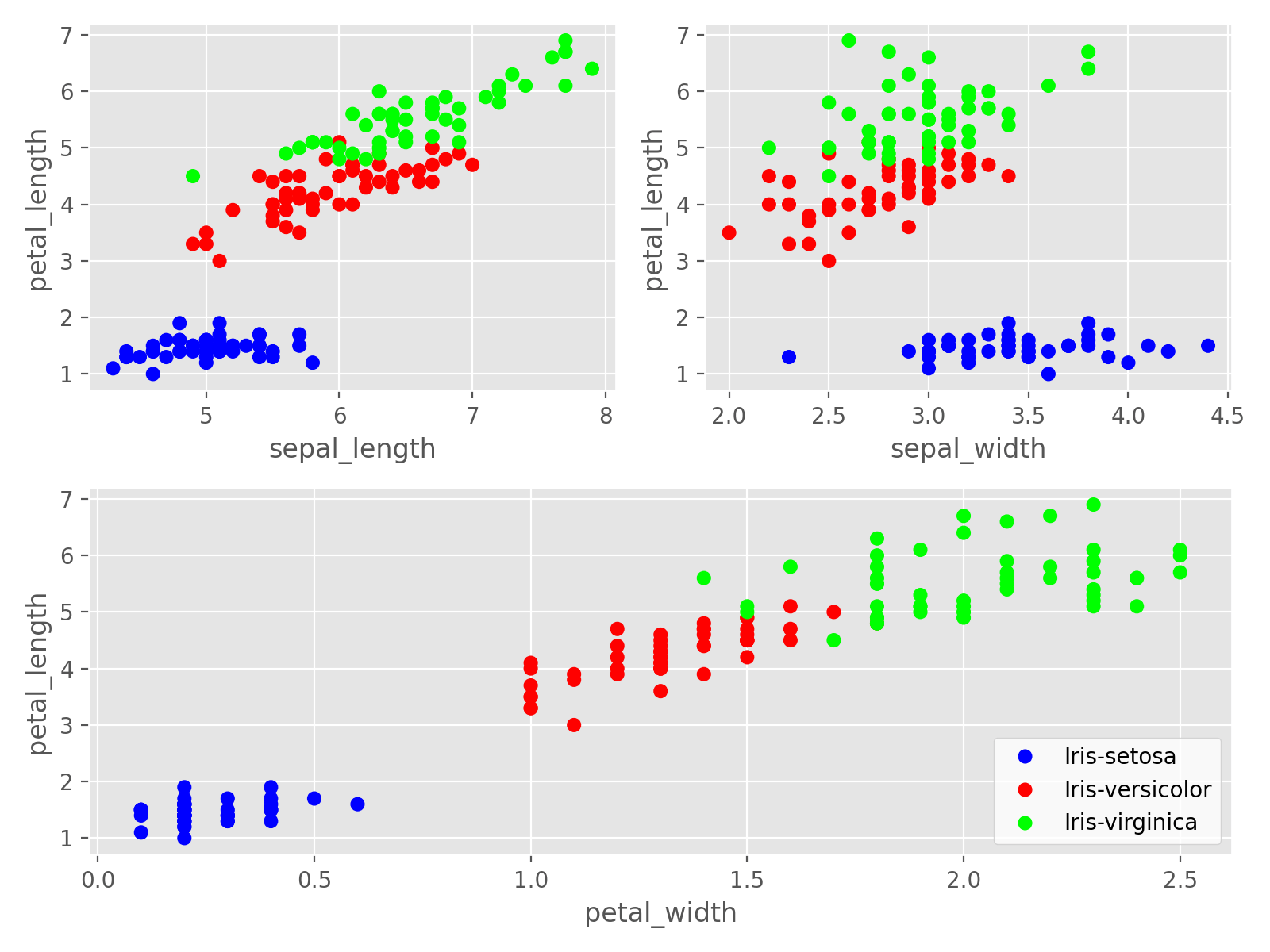
The Iris Flower Dataset contains measurements on three species of iris flowers
import pandas as pd

# Fetch the data
iris = pd.read_csv("https://raw.githubusercontent.com/practiceprobs/datasets/main/iris/iris.csv")

# Inspect the first 5 rows
iris.head()
#    sepal_length  sepal_width  petal_length  petal_width      species
# 0           5.1          3.5           1.4          0.2  Iris-setosa
# 1           4.9          3.0           1.4          0.2  Iris-setosa
# 2           4.7          3.2           1.3          0.2  Iris-setosa
# 3           4.6          3.1           1.5          0.2  Iris-setosa
# 4           5.0          3.6           1.4          0.2  Iris-setosa

# Inspect the last 5 rows
iris.tail()
#      sepal_length  sepal_width  petal_length  petal_width         species
# 145           6.7          3.0           5.2          2.3  Iris-virginica
# 146           6.3          2.5           5.0          1.9  Iris-virginica
# 147           6.5          3.0           5.2          2.0  Iris-virginica
# 148           6.2          3.4           5.4          2.3  Iris-virginica
# 149           5.9          3.0           5.1          1.8  Iris-virginica

# Inspect the species values
iris.species.value_counts()
# Iris-setosa        50
# Iris-versicolor    50
# Iris-virginica     50
# Name: species, dtype: int64Suppose we want to build a model to predict petal_length. It'd be useful to visualize petal_length versus the other three continuous variables: sepal_length, sepal_width, and petal_width, each colored by species. Do that, mimicking the plot below.
Notes
Show the plot
Solution
This content is gated
Subscribe to the product below to gain access